Context
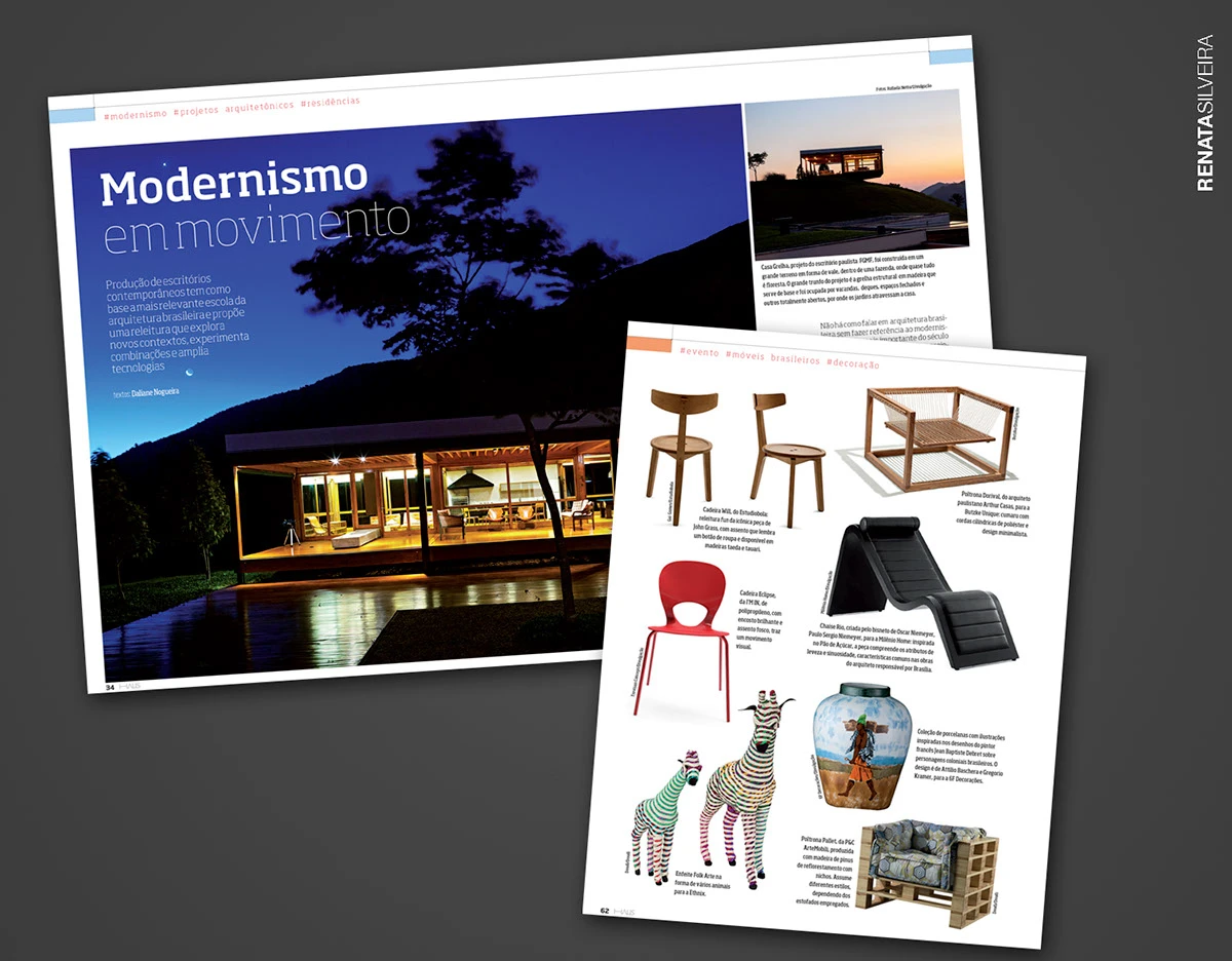
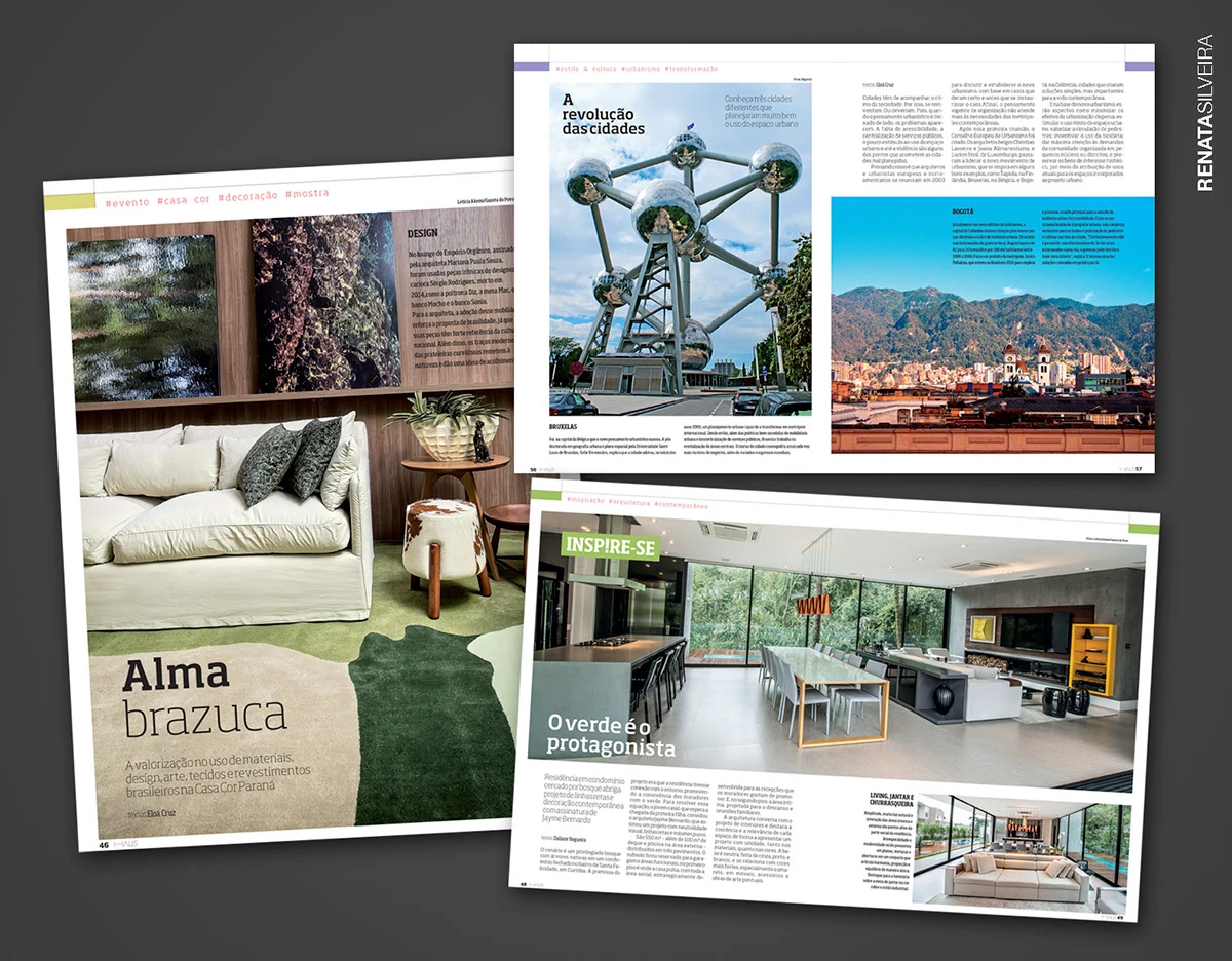
HAUS is Gazeta do Povo's multiplatform product focused on architecture, interior design, style, and culture — its main platform was a printed magazine.
Gazeta do Povo contacted the agency I worked for to design a website showcasing the projects, architects, and products featured in the magazine.
This was one of my first projects as a UI/UX designer, taking around two weeks from benchmark research to generating alternatives and idealizing the concept.
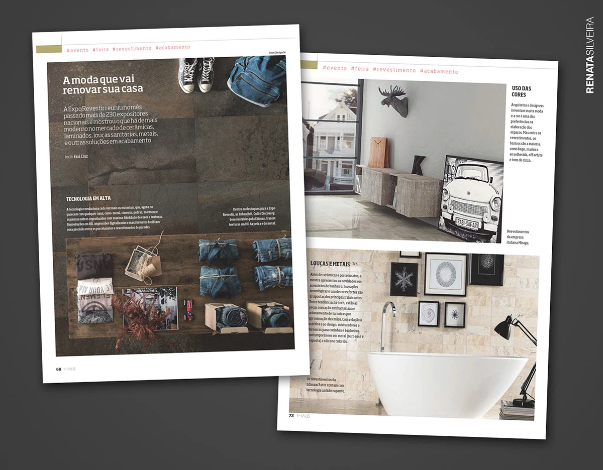
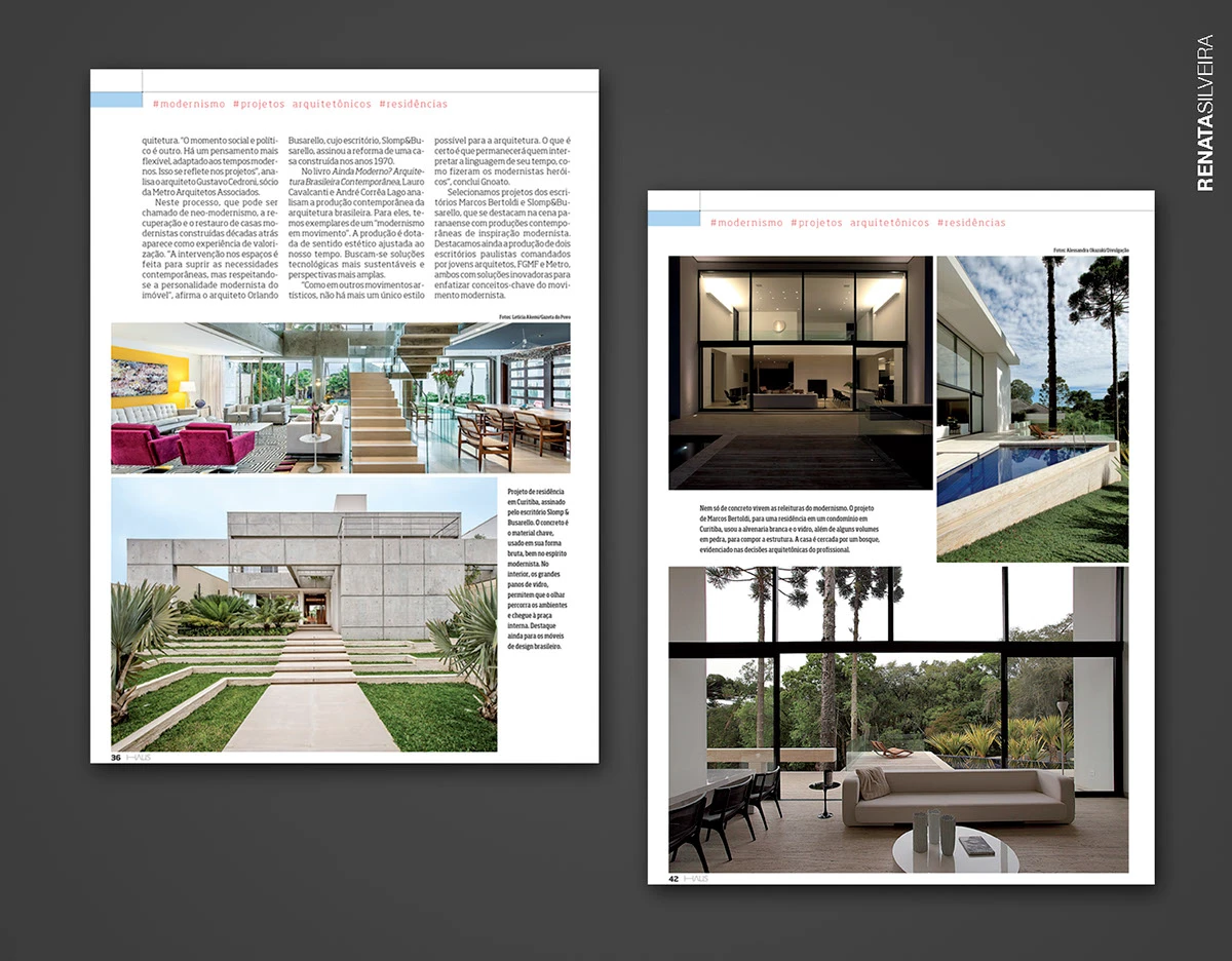
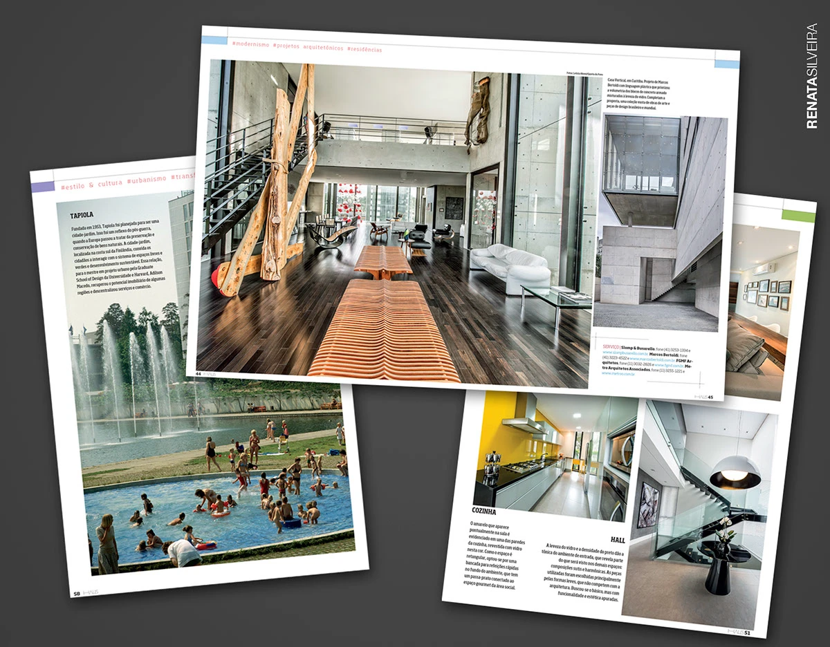
The challenge was to design a website connecting three pillars: a gallery of real projects for inspiration, a shop of decor products, and a directory of architects — all cross-linked, so a piece you like in a project leads straight to buying it or learning more about the architect behind it.
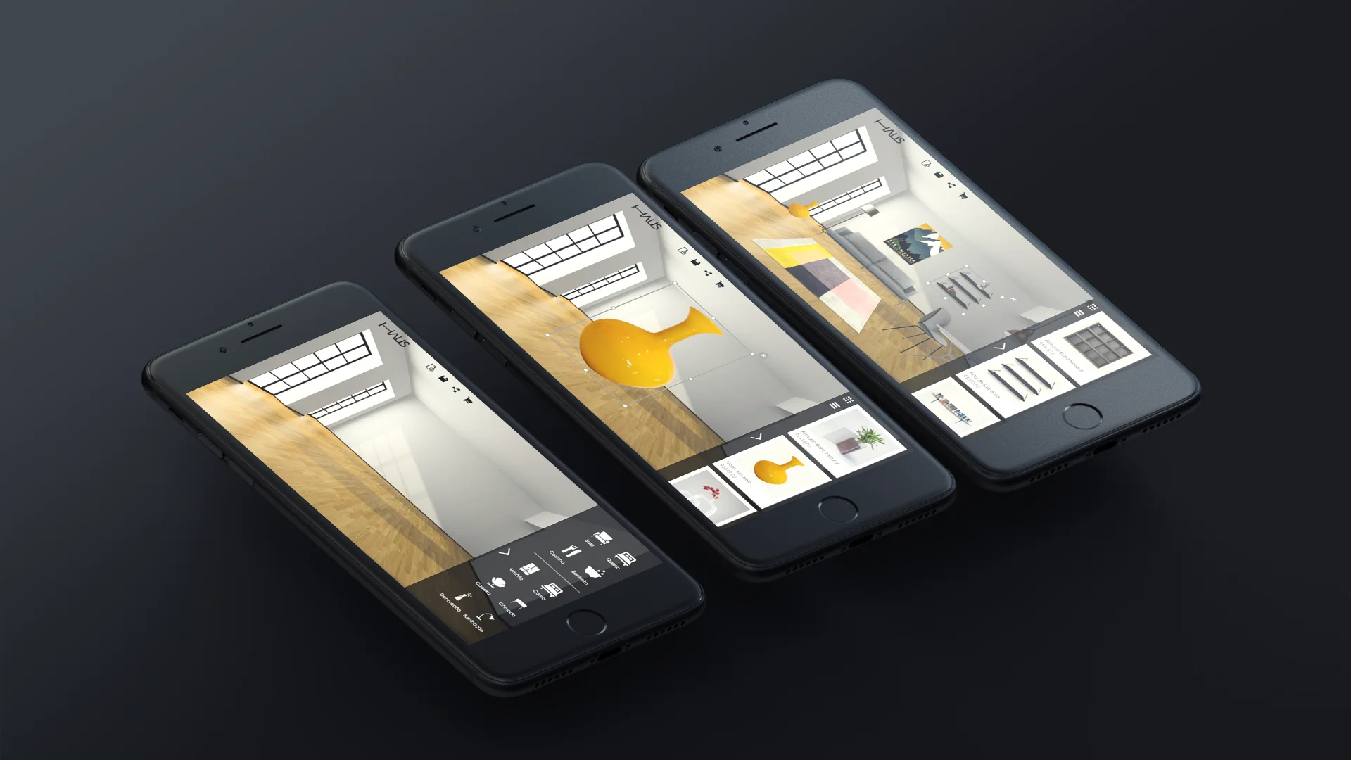
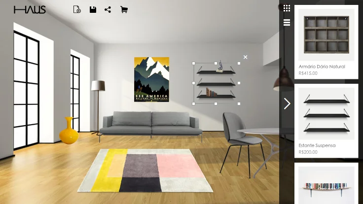
I also idealized a mobile app, letting people simulate furniture and decor items in their own space using a photo of their interior.
Benchmarking
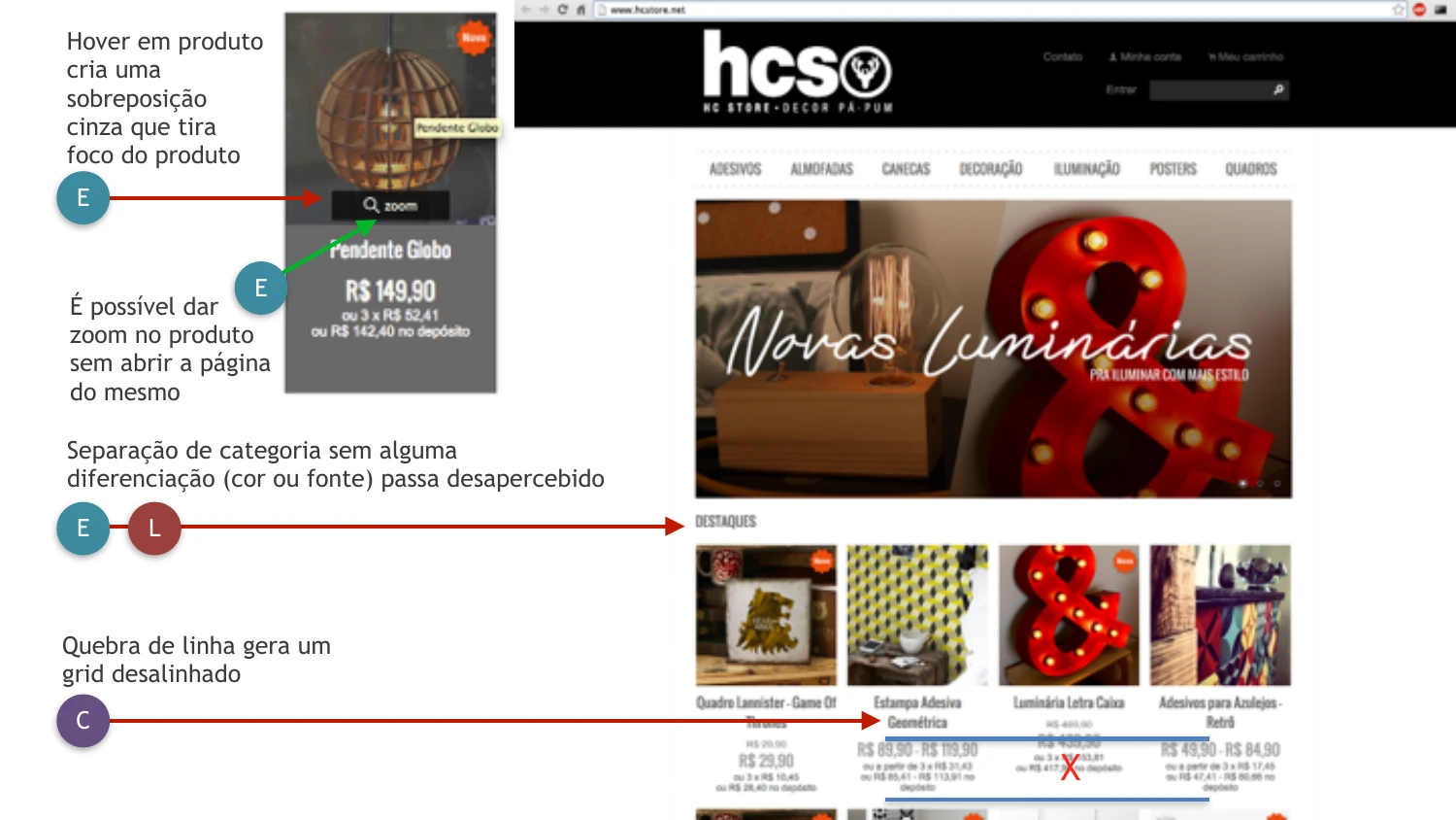
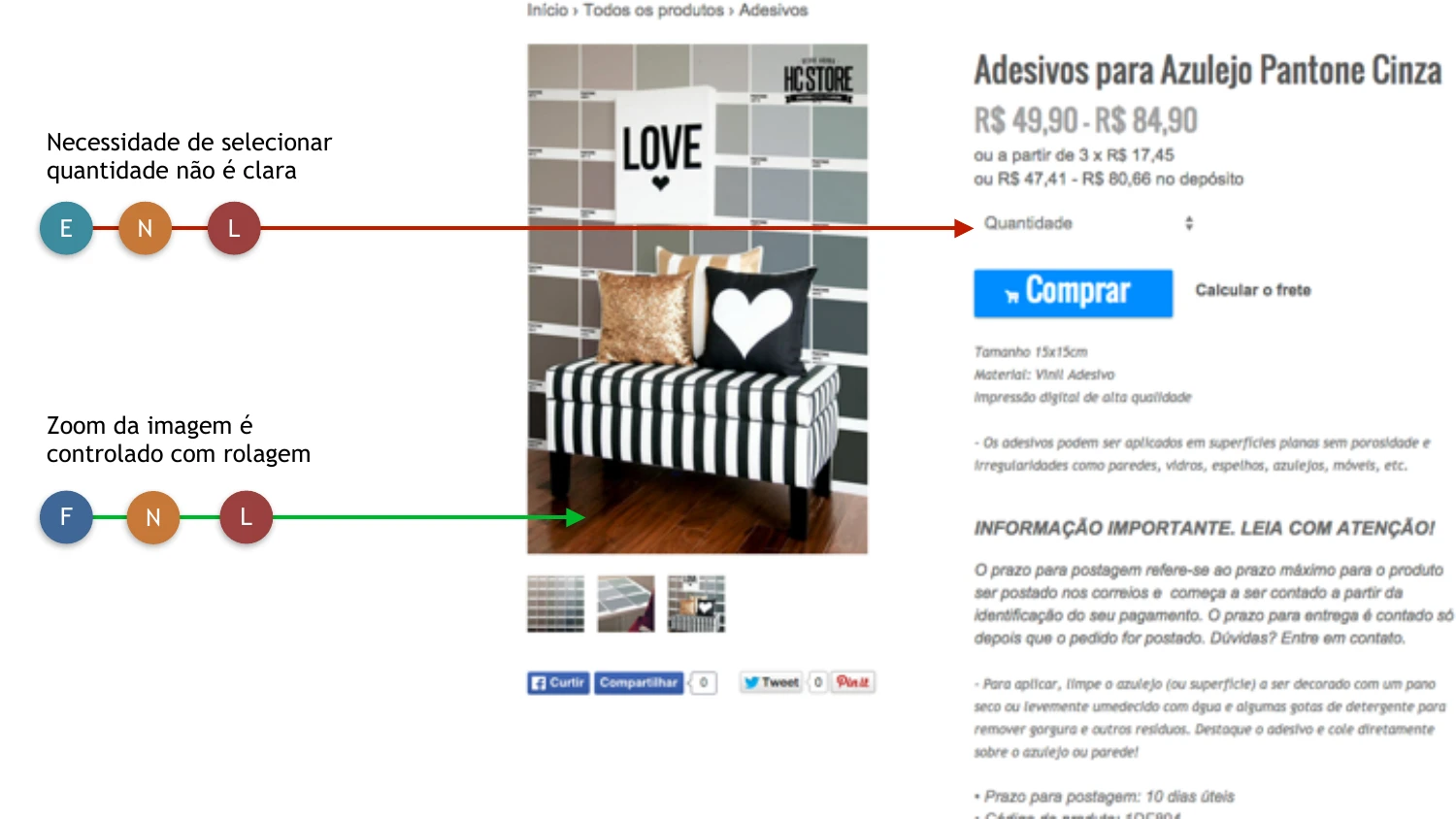
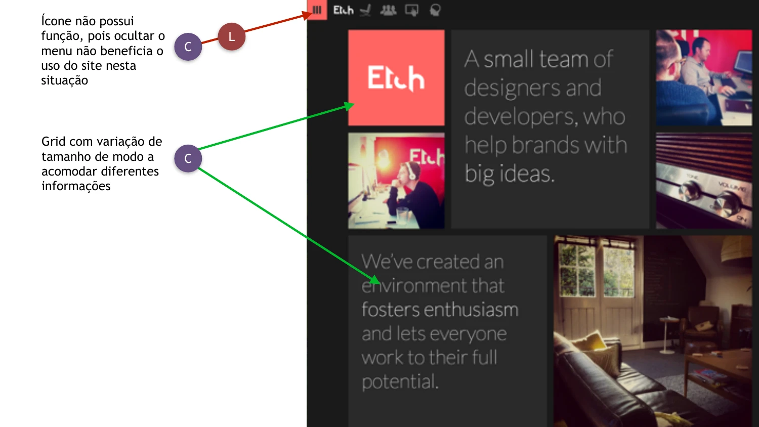
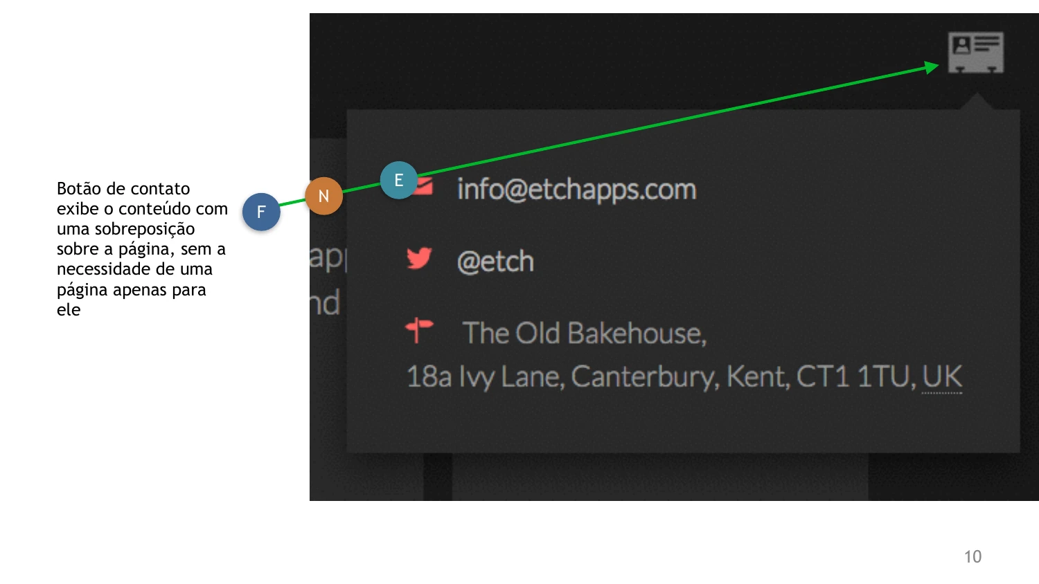
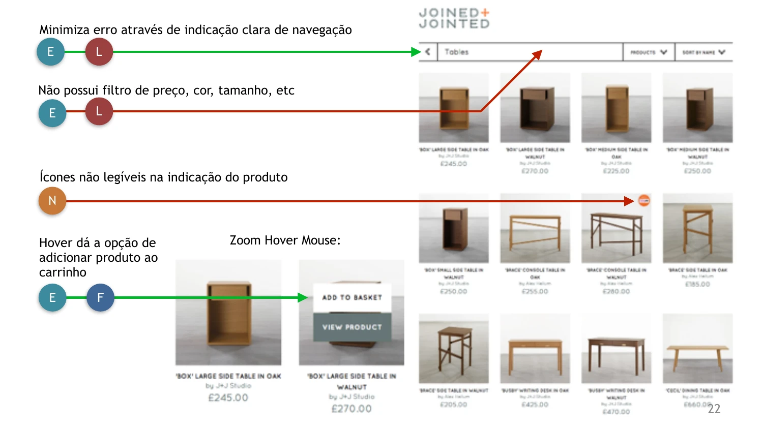
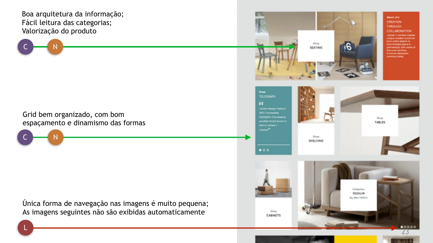
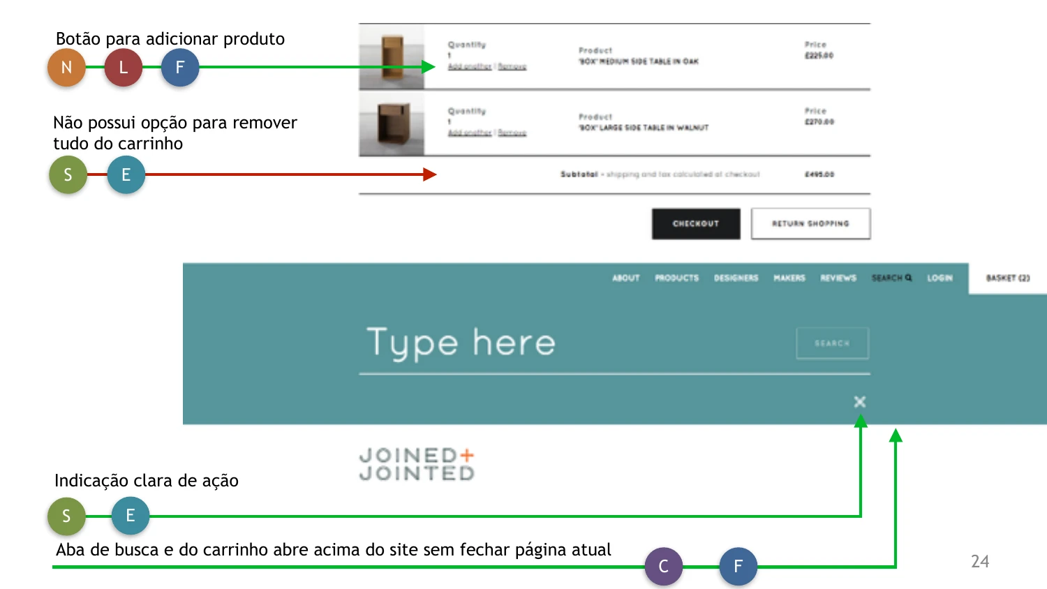
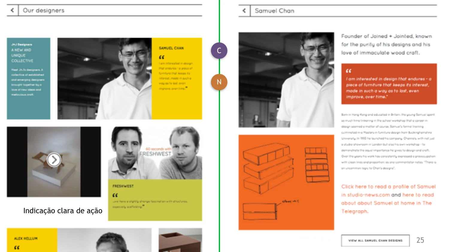
Before sketching any screens, I ran a heuristic evaluation of five sites with similar goals — HC Store, Etch, Grovemade, Fubiz Shop, and Joined & Jointed — to map out what worked well and what didn't, and to catch requirements the brief hadn't covered.
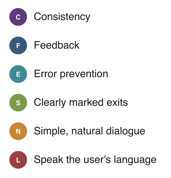
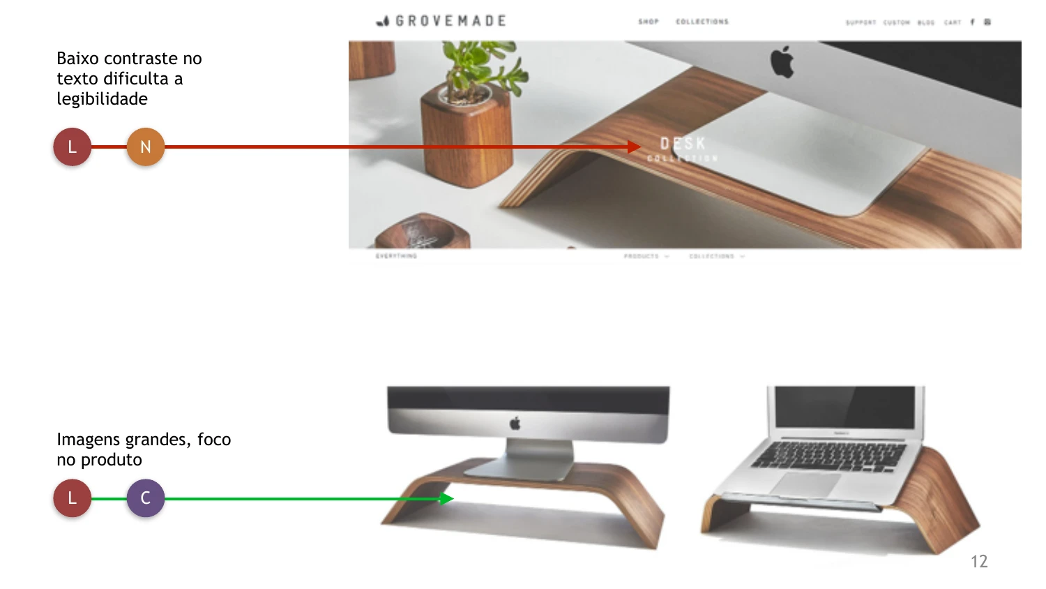
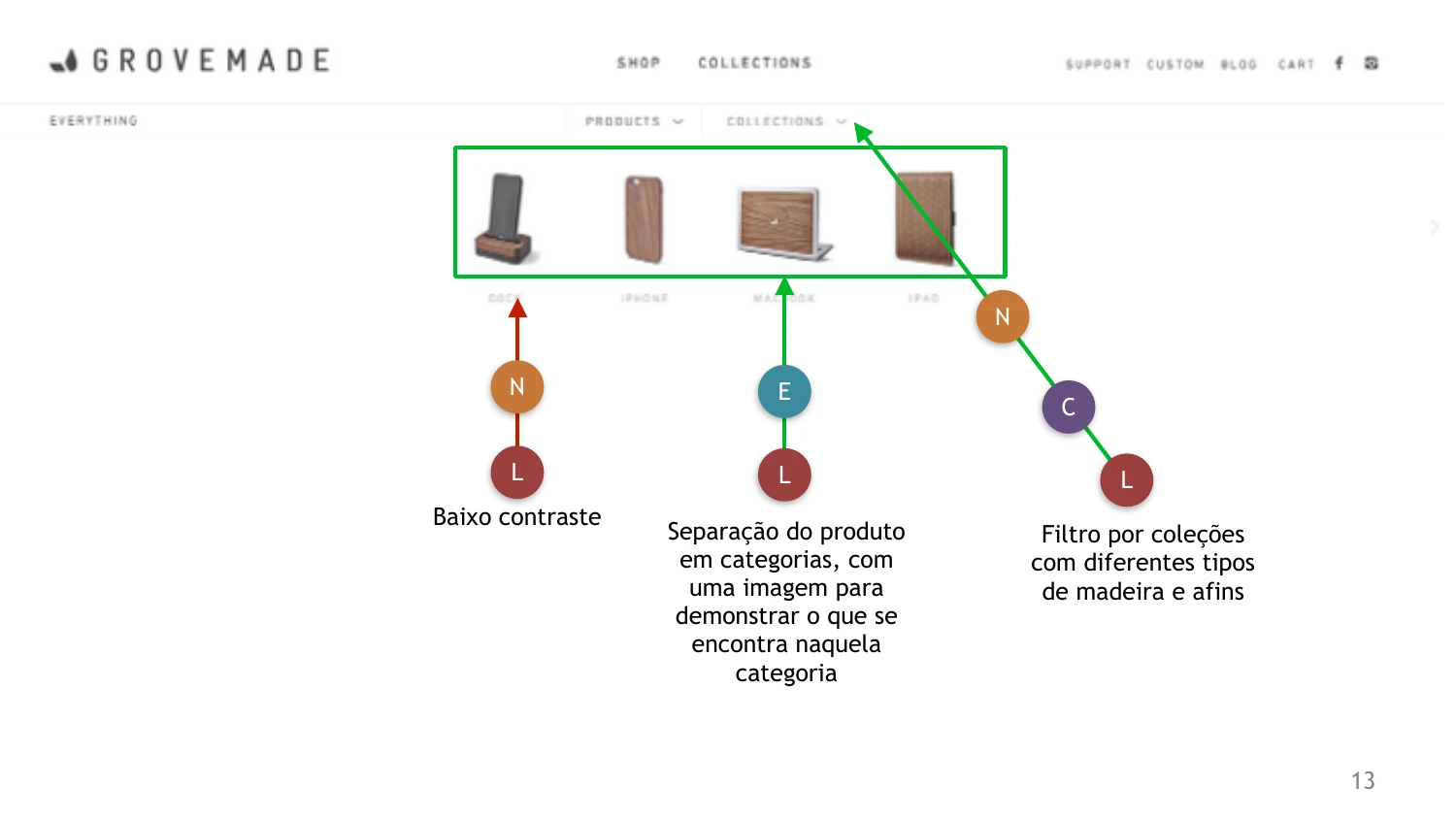
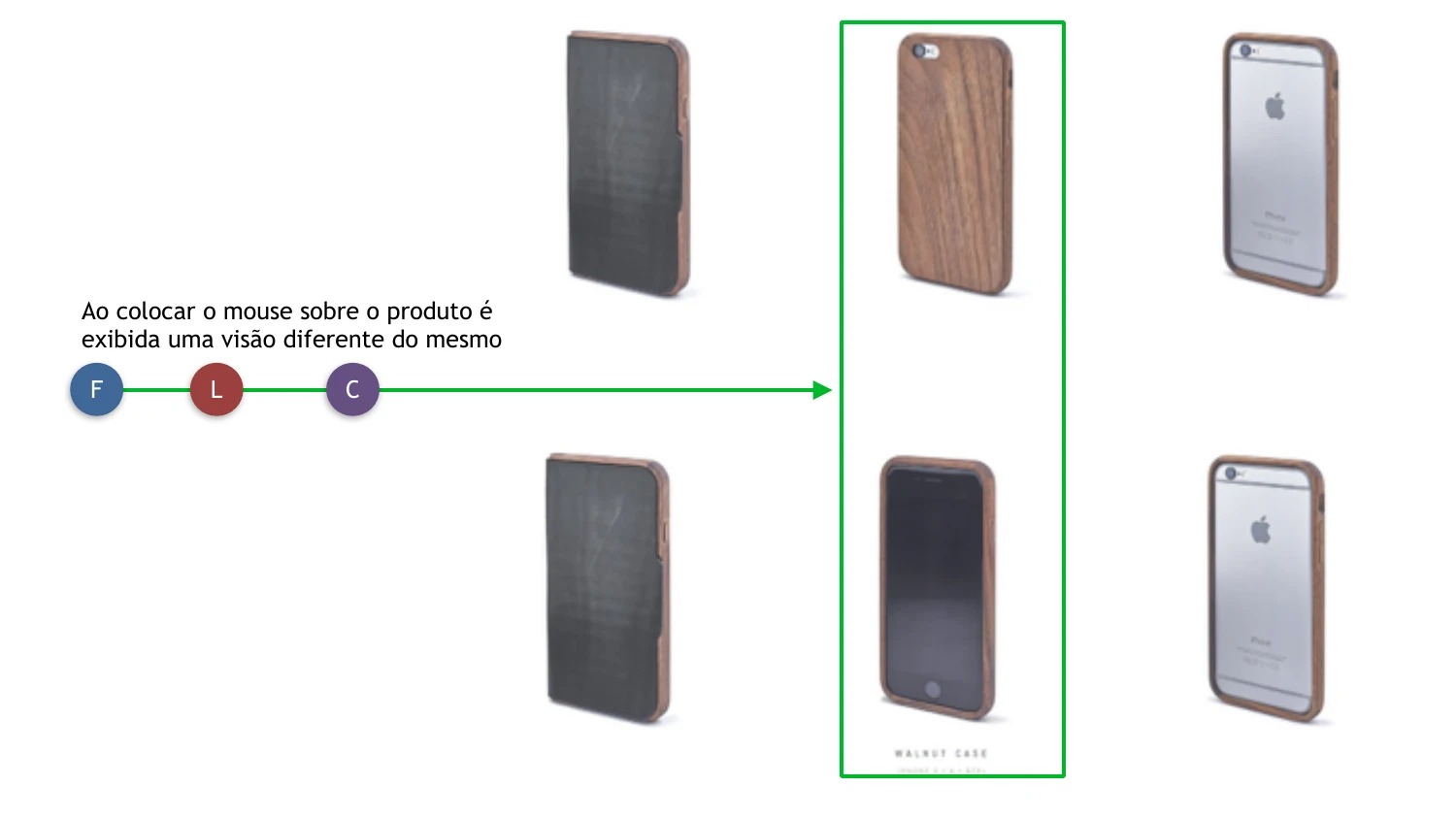
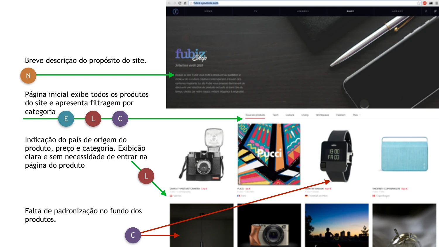
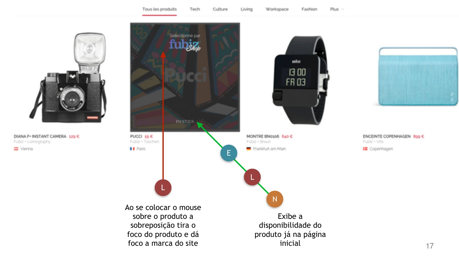
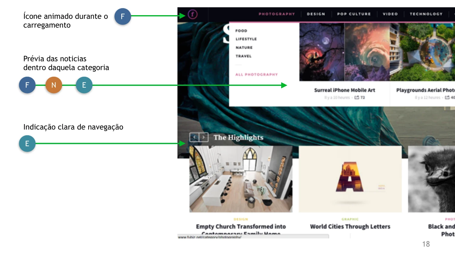
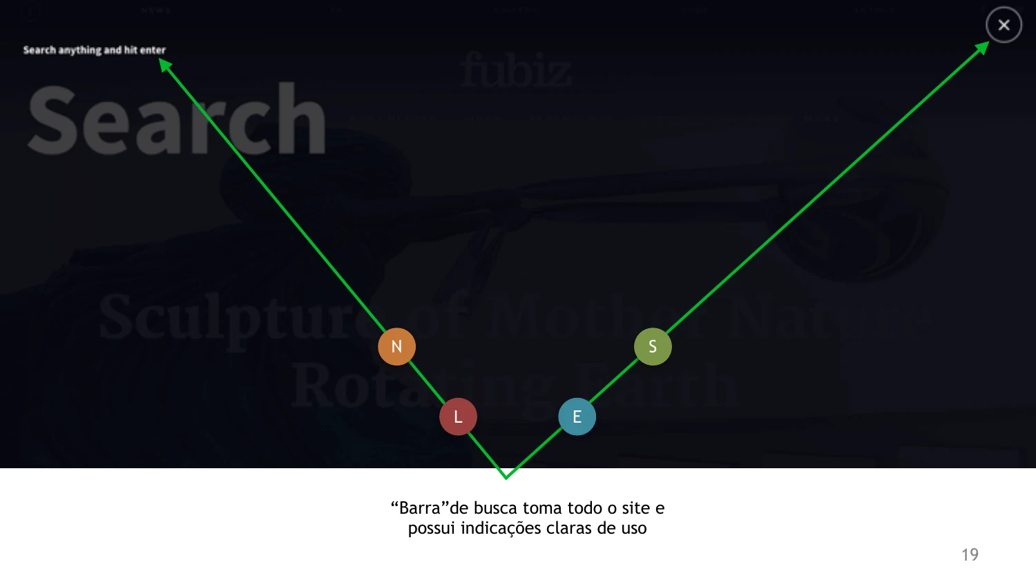
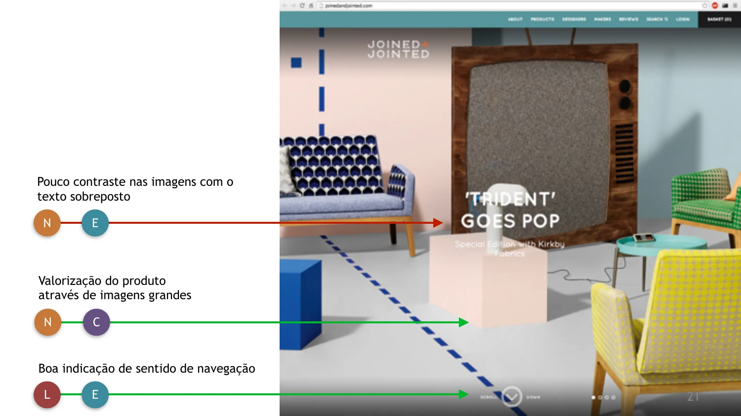
I checked a few pages of each site against the six usability heuristics below, tagging every finding with the principle it related to, so patterns across the five sites were easy to spot. Green arrows mark good practices; red arrows mark issues.
Key takeaways
- Large, focused product photography consistently read as more premium than cluttered grids.
- Clear category filters and visible navigation cues reduced user errors.
- Overlays that dim the whole page, like on hover, can pull focus away from the product itself.
- Showing stock and availability directly on listing pages helped users decide faster.
- A dedicated page per designer or maker made craftspeople feel like part of the brand story.
Landing page
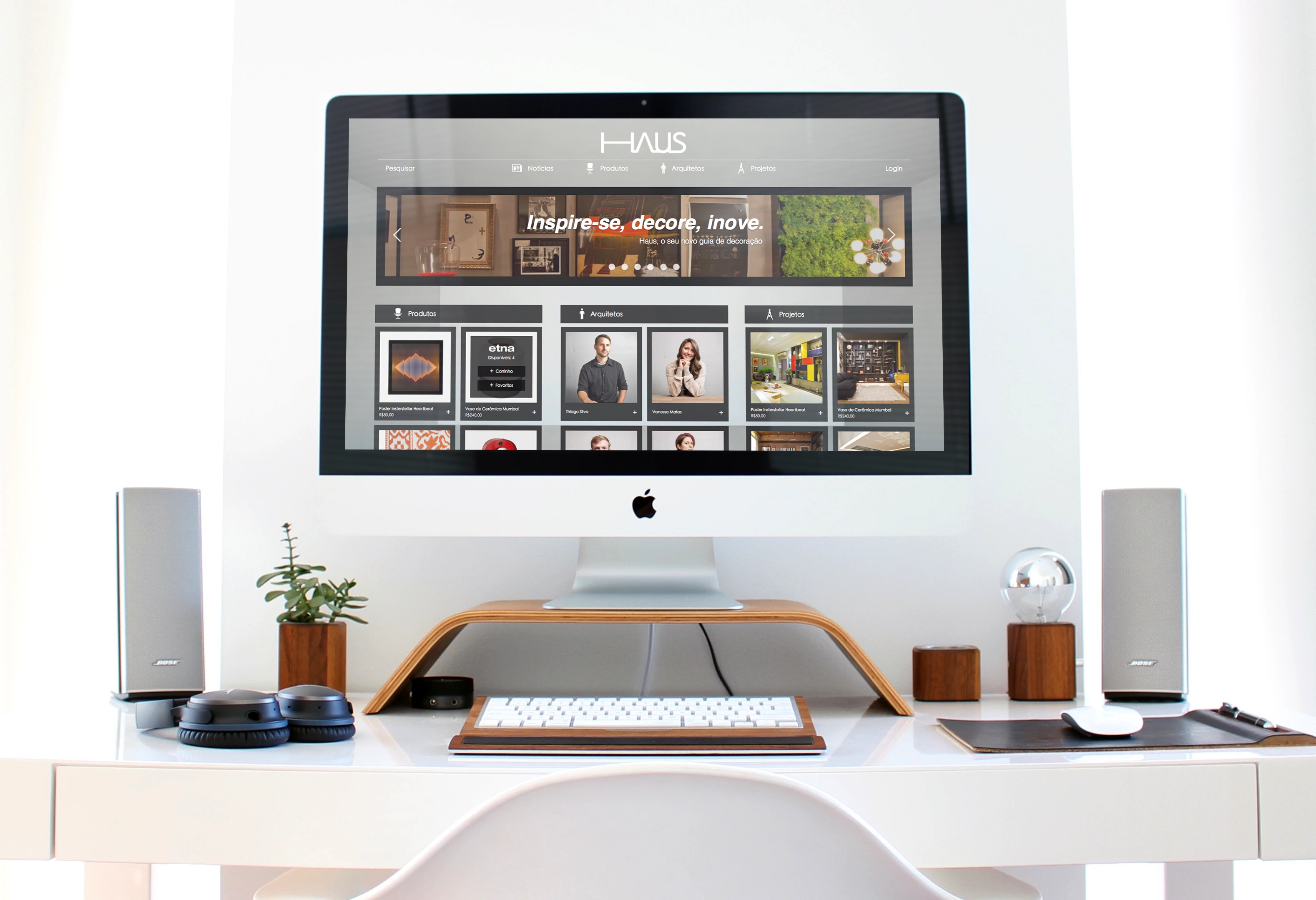
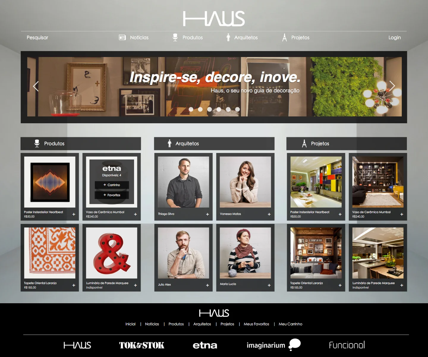
"Inspire-se, decore, inove" — get inspired, decorate, innovate. The landing page opens with a rotating gallery of decorated spaces, then surfaces the three pillars of the site side by side: Products, Architects, and Projects.
Projects page
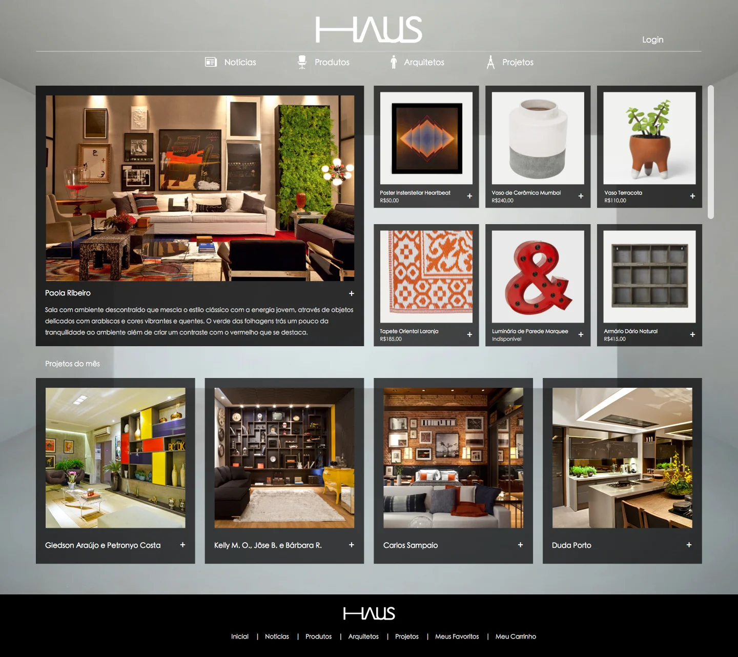
Every month, Haus publishes a new decorated space. The projects page leads with that month's featured room, alongside the products used in it, and a grid of the month's other submissions below.
Architect page
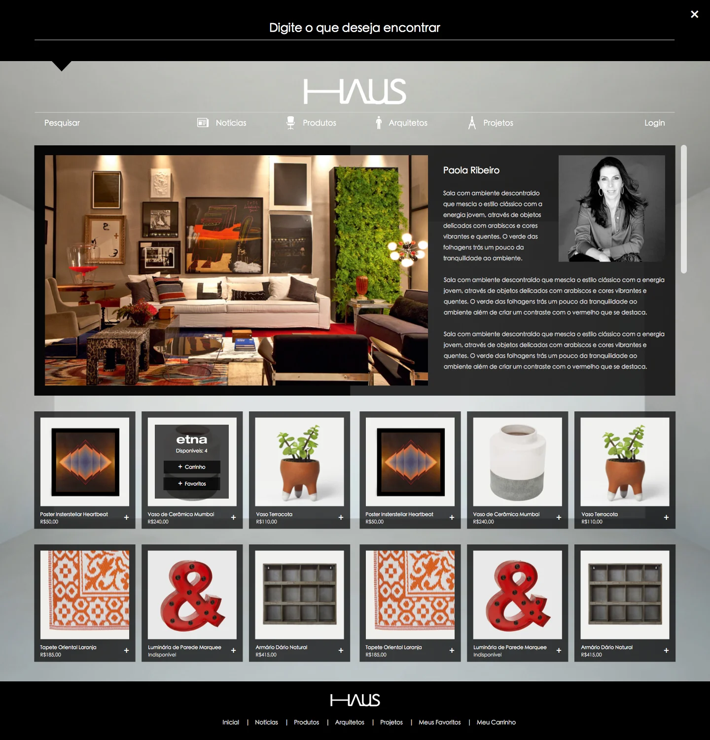
Opening a project introduces the architect behind it, along with their description of the space and the products they used — or similar pieces that would fit the same style.
Products page
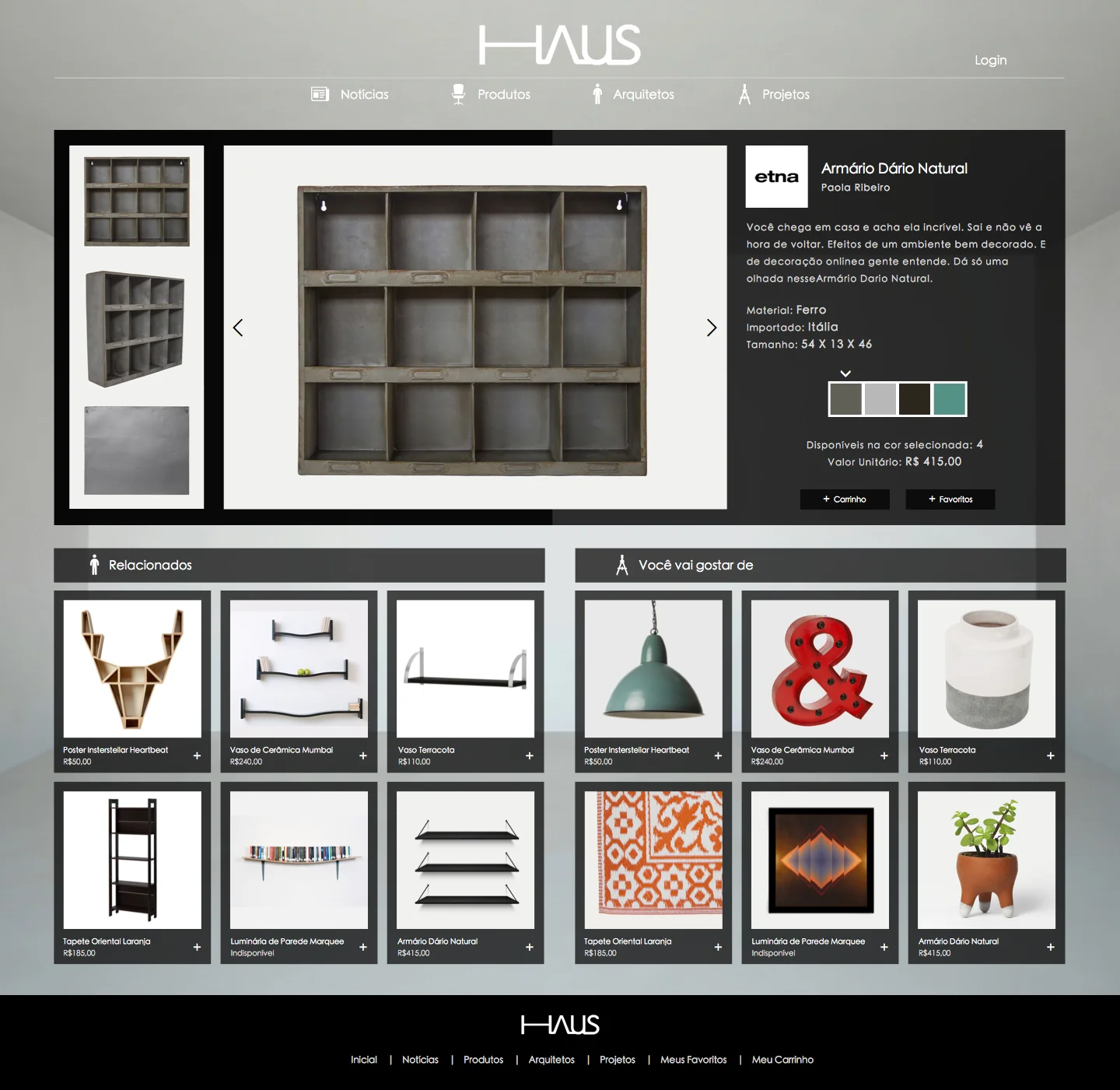
Each product page covers material, dimensions, country of origin, available colors, and live stock count, plus "Related" and "Suggested for you" shelves to keep people browsing.
Mobile app
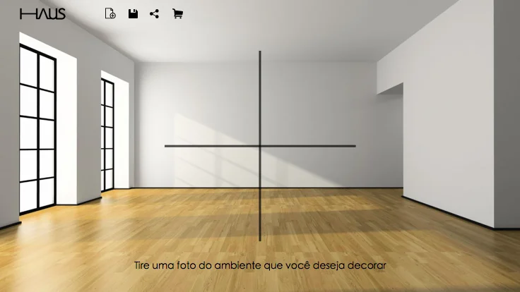
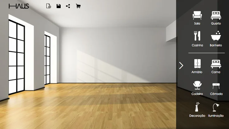
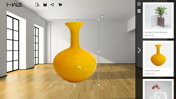
The idea for the Haus app was to lets people place images of real products from the website into a photo of their own interior to simulate a full decoration. This tool would allow users to visualize how products interact with their actual space before buying it.